EMS Software
EMS Software (an Accruent Company) is the most powerful workspace management platform for the enterprise and campus. Whether booking workspaces or scheduling final exams, EMS refines how individuals find and reserve the right space for their needs.
Within the last year, EMS enhanced its workspace software by leaps and bounds and it simply felt like the brand identity couldn’t keep up. Through research and thoughtful construction, we developed a mark that honored the equity of EMS in the marketplace and celebrated the overarching concept of space, dimension and connectivity.
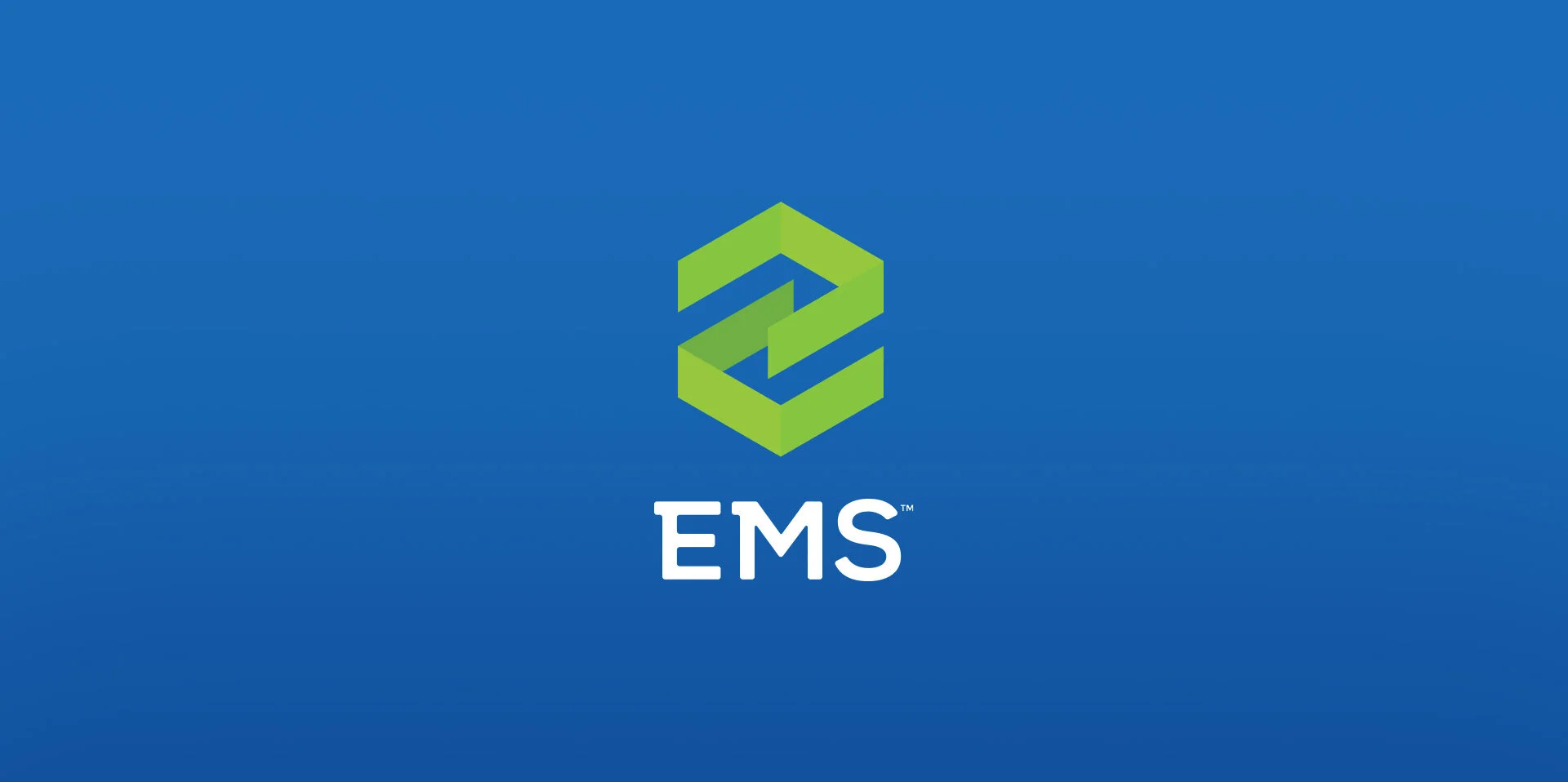
EMS Software links physical spaces to the digital world. The new brand identity does the same. Dimensional, outlined shapes convey two spaces linking together to form the letter e.
EMS has been connecting people to workspace tools for almost 30 years, so color equity was a big concern when upgrading the brand identity. We wanted to introduce a color palette that felt more awake and energetic—something to mimic the software’s ability to plan for the future.
In conjunction with the brand launch, an infographic was created to promote the updated brand identity, color palette, and content messaging framework.


