Vero Networks
Vero Broadband was in the process of creating a flagship brand to oversee its range of services: a fiber infrastructure that designs, builds, owns, and manages fiber networks. This flagship brand needed a major upgrade—one that felt reliable, connected, and trustworthy.
We are happy to announce that the Vero logo has been awarded publication in LogoLounge Book 14, the world’s premier logo showcase.
The new brand identity is dependable and trustworthy with a touch of personality. With a nod to the rural and underserved communities whom Vero services, this mark depicts open arms reaching outward while also looking inward to the point of the V, with some visual similarities to the standardized download icon. The simplicity and strength of the icon depict integrity, confidence, dependability and reliability...an icon that has presence and authenticity.
Any brand update requires that we take a serious look at color equity. VERO had a strong hold on their navy blue, but needed an injection of personality and energy. We decided on strengthening the blue palette with an ultramarine bright blue and holding on to the yellow equity for education verticals. Variations of blue always signify authority, trust, and confidence—perfect for the Vero flagship brand.
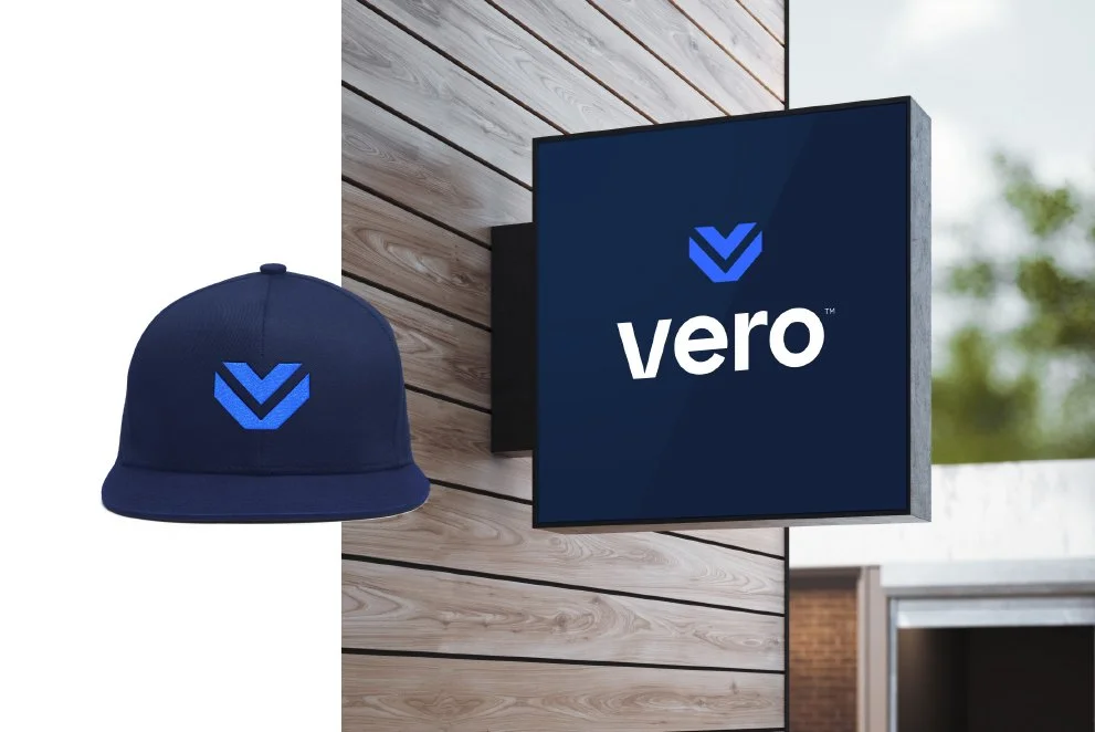
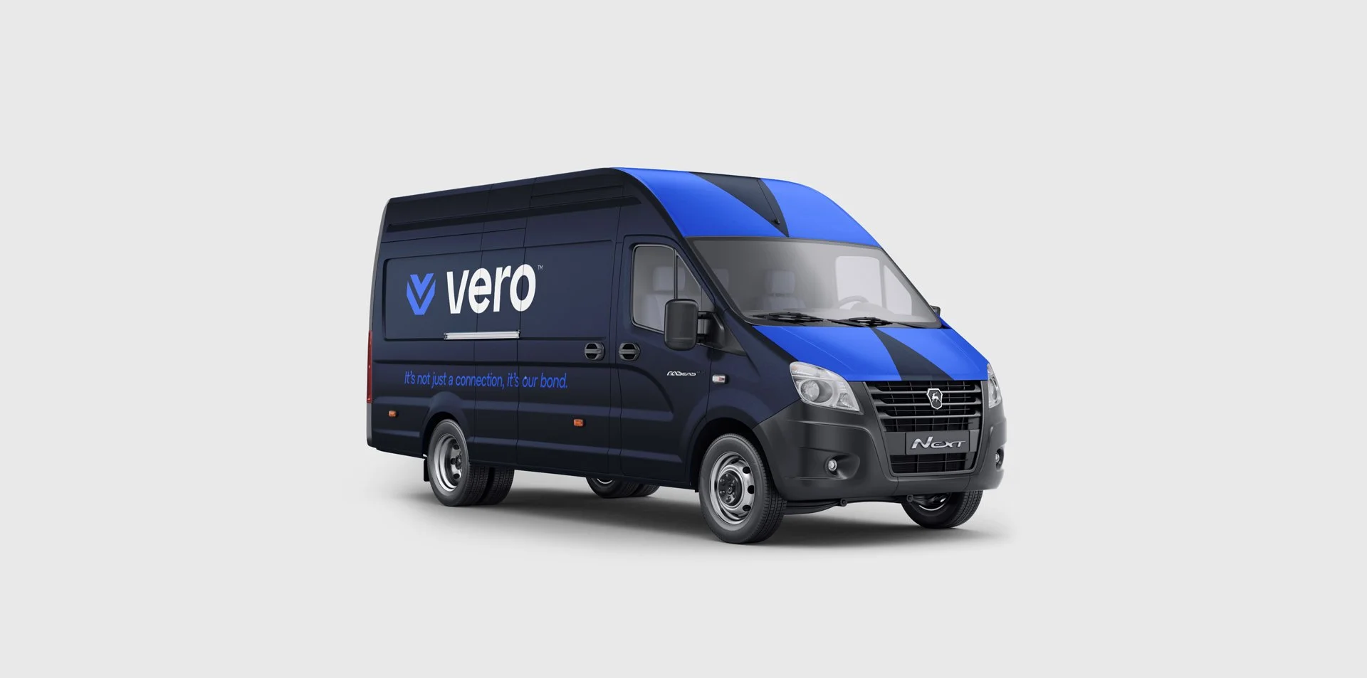
Real world applications using the new Vero flagship brand.


