Unanet
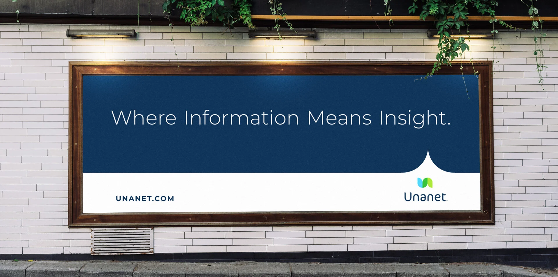
Unanet is a decades-long provider of ERP and CRM solutions purpose-built for Government Contractors, A/E/C, and Professional Services. As a one-database solution, Unanet delivers insight and clarity by reconciling data so that you can automate basic business processes. The original brand identity was in need of an overdue update—one that celebrated the past while incorporating real meaning.


The new brand identity is thoughtful, modern, and purposeful. A combination of U and N shapes create a flow from left to right, signifying data going in and data being released out. Colors visually overlap to bring two shapes together to naturally create the updated brand green. Our typography choice brings a level of sophistication and personality while remaining approachable. You could say it even mimics the curves and lines of the identity icon as well.
Any brand update requires that we take a serious look at color equity. The original blue and green were so primary and secondary that they lacked proper contrast. By establishing a darker blue, we were able to create a so-called foundation for the rest of the upgraded palette.

Real world applications using the new Unanet brand.